Struggling to choose between maroon and burgundy? A wrong choice can misrepresent your brand's style. I'll show you how to pick the right one for your clothing line.
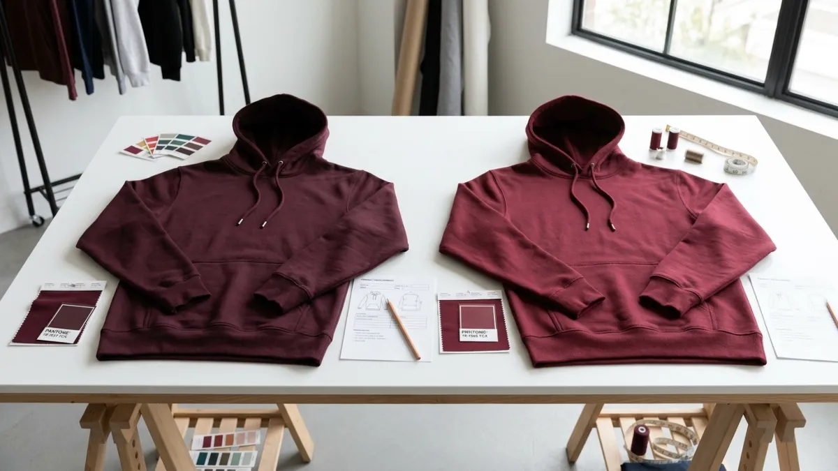
Maroon is a warmer, browner red, ideal for stable, classic basics. Burgundy is a cooler, purplish red1 that adds a sophisticated, stylish feel. The choice depends on your brand's identity and the product's goal, not just the color name.

Choosing between these two isn't just about personal preference. It's a strategic decision2 that affects your product's feel, production risk, and brand message. Many young brands think they are just two similar deep reds. In one development round, a client asked for burgundy based on a campaign image, but after seeing the first fleece sample, they said it felt too dull and slightly too purple. What they actually wanted was a steadier, browner deep red closer to maroon. That kind of mismatch happens more often than most young brands expect.
Maroon vs Burgundy: What’s the Actual Difference in Clothing?
You see two deep reds that look similar on screen. But in clothing, they create completely different vibes. For apparel, the difference is less about dictionary definitions and more about the kind of product impression each shade creates.
Maroon is a deep, brownish-red. Think of it as stable, warm, and classic. Burgundy is a deep, purplish-red, often seen as more refined, cool-toned, and fashionable. The difference is about character: Maroon is a "product color3," while Burgundy is a "brand color4."

I often tell my clients that maroon is a "product color" and burgundy is a "brand color." What do I mean by that? For example, when a brand is building a core hoodie program that needs to restock across seasons, I usually see maroon perform more steadily. But when they want one item in the range to feel more elevated on the rail or in campaign images, burgundy is often the shade they test first.Maroon is a workhorse. It’s grounded, earthy, and has a brown undertone that makes it feel sturdy and reliable. It’s perfect for core products like hoodies, basic t-shirts, and polo shirts. It's a color that sells consistently without needing a lot of fashion hype. It’s safe, dependable, and very hard to get wrong.
Burgundy, on the other hand, is about making a statement. It has a purple or wine-colored undertone that gives it a more luxurious and sophisticated feel. It feels more intentional and stylish. This is the color you use when you want to elevate a simple piece or create a memorable item for a seasonal collection. But this refinement comes with a challenge. Its character depends on getting that delicate balance of red and purple just right.
| Aspect | Maroon | Burgundy |
|---|---|---|
| Undertone | Brown, Earthy | Purple, Wine |
| Temperature | Warmer | Cooler |
| Vibe | Stable, Classic, Grounded | Sophisticated, Fashionable, Rich |
| Best Use | Core basics, team wear | Statement pieces, premium lines |
| Industry Term | A "Product Color" | A "Brand Color" |
Why Do Maroon and Burgundy Look Different on Fabric, Not Just on Screen?
Did your sample color look different from the screen swatch? Fabric texture and material dramatically alter how colors appear. This is a common and costly surprise for many brands.
A color is not just a code; it's a reaction with fabric. Cotton absorbs light, making colors softer. Fleece scatters light, making them appear muted. Shiny fabrics reflect light, enhancing a color's undertones. The same burgundy can look premium on one fabric and dull on another.

This is probably the most valuable lesson I've learned. You aren't just picking a color; you're picking how that color will live on a specific fabric. A Pantone chip or a screen color is flat. Fabric has texture, depth, and a unique way of interacting with light. Here’s how these two colors behave on different materials.
On Pure Cotton Knits (Jersey, French Terry)
On standard cotton fabrics used for T-shirts and sweatshirts, the fibers tend to absorb light. This gives colors a softer, more matte appearance. Maroon thrives here. Its brownish base looks rich and solid, giving the garment a sense of weight and quality. Burgundy can also work, but if the dyeing process isn't perfectly controlled, it can lose its sharpness and look a bit dull or muted, missing that "pop" of refined color.
On Fleece and Brushed Fabrics
Once you introduce a fuzzy texture like fleece or a brushed surface, the light scatters even more. This makes colors appear less saturated. Maroon is the safer bet on these fabrics. Its inherent heaviness works well with the cozy feel of fleece. Burgundy, however, can be tricky. The fuzzy texture can muddy its cool undertones, making it look less like a sophisticated wine red and more like a simple, dark red.
On Smooth or Shiny Fabrics
This is where burgundy truly shines. On fabrics with a smoother, tighter weave or a slight sheen—like a fine-gauge knit or a mercerized cotton—the surface reflects light. This reflection picks up burgundy's subtle purple undertones, creating a beautiful, deep, and layered color. It looks expensive. Maroon on these same fabrics can sometimes look a little too plain or flat, lacking the complexity that makes a garment feel special.
How Do Maroon and Burgundy Influence Product Development Decisions?
Choosing a color isn't the final step; it's the first. Your choice between maroon and burgundy will guide your entire product strategy, from design to marketing.
Maroon suits foundational items like classic hoodies, polos, and team uniforms because it's stable and timeless. Burgundy works better for fashion-forward pieces5, seasonal campaigns, and items you want to position as premium. The color sets the product's market position from the start.

When a brand comes to me, I don't just ask what color they want. I ask what the product is supposed to do. Is it a core item that needs to be in stock for years? Or is it a seasonal star meant to grab attention? The answer often points directly to either maroon or burgundy.
Products Best Suited for Maroon
Maroon is the king of evergreen styles. Its classic feel makes it a perfect choice for:
- Basic Hoodies and Sweatshirts: It offers a nice alternative to black, navy, and grey.
- Polo Shirts: It has a slightly preppy, academic feel that works well for this style.
- Campus and Team Apparel: It’s a traditional team color that feels official and strong.
- Workwear-Inspired Lines: Its earthy tone aligns perfectly with a rugged, durable aesthetic. Maroon is practical. It's a color that customers understand and feel comfortable with immediately. It doesn't try too hard, and that's its strength.
Products Best Suited for Burgundy
Burgundy is for when you want to add a touch of sophistication or trendiness. It’s ideal for:
- Fashion-Forward Knits: A simple sweater in burgundy instantly looks more expensive.
- Premium Loungewear Sets: It gives a relaxed silhouette a more deliberate, high-end look.
- Holiday or Autumn/Winter Collections: The color has a festive, rich feel perfect for seasonal drops.
- Womenswear or Gender-Neutral Lines: Its complexity appeals to a customer with a more developed fashion sense. Burgundy has a natural "display" quality. In a retail store or on a website, it catches the eye and suggests a higher price point.
Which One Is Safer for Bulk Production, and Which One Builds More Brand Character?
You want a unique color, but you fear production issues. Choosing between safety and character is a key dilemma. One color is stable; the other is stylish but risky.
Maroon is safer for bulk production. Its wider tolerance means slight variations are less noticeable and more acceptable. Burgundy builds stronger brand character but is riskier. Its delicate balance of red and purple means small dyeing shifts can completely change its sophisticated feel.

I'll be honest: burgundy is much more likely to cause headaches in production. It’s not that it's a difficult color to dye. The problem is that its "correct" appearance is based on a very delicate balance. If the dye lot has a fraction too much purple, it looks like a plum. A bit too much red, and it just becomes a generic dark red, losing all its special character. I’ve seen clients reject samples because the burgundy didn't have "that specific feel," which is often a code for the red-purple balance being off.
Maroon is more forgiving. Because its base is a mix of red and brown, its acceptable range is much wider. A maroon that’s a little more reddish or a little more brownish is still clearly identifiable as maroon. Customers are less likely to notice or care about slight variations between production runs. This makes it a much safer choice for large orders or for core items that you plan to restock over several seasons.
So, the choice is a strategic trade-off:
- Choose Maroon for: Stability, consistency, and low production risk.
- Choose Burgundy for: A strong brand statement6, higher perceived value, and unique character, but be prepared for a more intensive sampling and quality control process.
How Can You Brief a Supplier Clearly When Choosing Maroon or Burgundy?
Vague color requests like "a nice deep red" cause expensive delays. Clear communication is key to getting the color you want. Here’s how to brief your manufacturer properly.
Never just send a color name or a screen image. Provide a physical swatch or a Pantone (TCX) code. More importantly, describe the undertone: "maroon with a brown undertone," or "burgundy, no purple cast, cool tone." Always confirm on the actual bulk fabric.

One of the most common issues we face is a vague brief. A client will send a picture from Pinterest and say, "I want this color." The problem is that photo has been filtered, edited, and is displayed on a screen with its own color settings. It's a recipe for disappointment. In my factory, we've developed a clear process to avoid this.A more realistic process usually looks like this: the client sends a reference image, we first confirm whether the target sits closer to maroon or burgundy, then we narrow it down by undertone—more brown, more wine, less purple, less brightness. Only after that does the lab dip become meaningful.
Ditch Ambiguous Terms
Words like "rich," "deep," or "premium" are great for marketing, but they are useless for production. We need technical descriptions.
Provide Concrete References
The best reference is always a physical piece of fabric. The second best is a Pantone TCX color code7, as this system is designed for textiles. An image should only be used as a mood reference, not a technical one.
Describe the Undertone
This is the most helpful addition to a color code. Be specific.
- For Maroon: "Maroon with a strong brown base," or "A warm, earthy maroon, not too red."
- For Burgundy: "A cool-toned burgundy with a visible purple cast," or "A deep wine red, avoid looking like a simple dark red."
Always Request a Lab Dip on Your Fabric
Before any production starts, you must get a "lab dip8." This is a small swatch of your actual, chosen fabric dyed to the color you requested. This is the only way to see how the color will truly look on your final product. Don't approve a color based on a swatch of a different material.
What Are Common Mistakes Brands Make When Comparing Maroon and Burgundy?
Many brands treat maroon and burgundy as interchangeable deep reds. This mistake leads to samples that feel "off" and don't match the brand's vision.
The biggest mistake is choosing the color name before the product's character. Brands often pick "burgundy" for its premium feel but put it on a basic fleece hoodie where a stable "maroon" would have performed better. They forget that fabric dictates the final color expression.

Over the years, I've seen brands make the same few mistakes repeatedly when developing products in these colors. Recognizing them can save you a lot of time and money.
One common case is when a client says they want "burgundy" because they associate it with high-end brands. They send a picture of a sleek, stylish sweater. But their product is a heavy, brushed fleece hoodie. When we make the sample, the burgundy looks dull and lifeless on the fleece. The client usually describes it in a vague way—too flat, too heavy, not premium enough, or just not what they imagined from the reference photo. In most cases, that reaction is not about the dye house missing the name “burgundy”; it is about the fabric changing the color’s mood.The problem wasn't the color; it was the misapplication. For that product, a rich maroon would have looked much better.
Another mistake is what I call "confusing a mood board color with a production color." A brand founder will fall in love with a color they see on Instagram. They will insist on matching it exactly. But they fail to understand that the image is an illusion created by lighting and photo editing. The real-world dyed fabric will never look like that. This leads to endless rounds of sample adjustments, trying to match a color that doesn't exist in reality. Many brands think they are choosing a color, but they are actually choosing the product's personality9.
Maroon or Burgundy: How Do You Choose the Right Shade for Different Clothing Goals?
You're ready to choose, but you need a final gut check. Let's walk through a simple decision-making process to ensure your color choice aligns with your business goals.
To choose, first assess your brand identity: classic or trendy? Then, consider your product: a basic or a statement piece? Finally, check your fabric: textured or smooth? Your answers will point clearly to either the safe, stable maroon or the stylish, distinct burgundy.
If you are ever unsure, don't just guess. Ask yourself these four questions. The answers will guide you to the right decision for your specific product.
Step 1: Analyze Your Brand Identity
Is your brand known for being timeless, reliable, and practical? Go with Maroon. Is your brand more fashion-forward, sophisticated, and trying to create a premium feel? Lean towards Burgundy.
Step 2: Define Your Product's Role
Is this a core item you'll sell year-round? Maroon is safer and more stable. Is this a limited-edition, seasonal statement piece designed to create buzz? Burgundy will make a stronger impact.
Step 3: Consider Your Chosen Fabric
Are you using a textured, heavy, or brushed fabric like fleece or heavy French terry? Maroon will likely perform better. Are you using a smooth, fine-gauge, or slightly shiny fabric? Burgundy will look more luxurious.
Step 4: Know Your Target Customer
Is your customer looking for easy, dependable wardrobe staples? They will likely gravitate towards Maroon. Is your customer more style-conscious and looking for unique pieces to express their personality? Burgundy will appeal more to them.
| Factor | Choose Maroon if... | Choose Burgundy if... |
|---|---|---|
| Brand Vibe | Classic, reliable, practical | Fashion-forward, premium, sophisticated |
| Product Type | Core basics, hoodies, team wear | Statement pieces, seasonal collections |
| Fabric | Textured, fleece, heavy cotton | Smooth, fine-gauge, slight sheen |
| Production Goal | Safety, consistency, large volume | Brand character, uniqueness, higher perceived value |
Conclusion
Choosing between maroon and burgundy is about matching the color's character to your brand's goals. Maroon offers stability, while burgundy provides distinction. Choose wisely for your next collection.If you want to avoid color confusion during sampling and choose a shade that fits both your brand image and production needs, we’re here to help. Get in touch with us for custom clothing development, fabric recommendations, and sample support.
Exploring burgundy's color profile can assist in selecting a sophisticated and stylish tone for your brand. ↩
Learn how choosing between maroon and burgundy can affect your brand's message and product feel. ↩
Explore why maroon is considered a product color and how it suits core basics and team wear. ↩
Understand why burgundy is seen as a brand color and how it enhances statement pieces and premium lines. ↩
Find out how burgundy can elevate simple designs into fashion-forward items for your brand. ↩
Explore how burgundy's unique character can enhance your brand's identity and perceived value. ↩
Learn how Pantone TCX codes provide precise color references, ensuring accurate production results. ↩
Understand the importance of lab dips in verifying color accuracy on your chosen fabric. ↩
Explore how maroon and burgundy can shape the character and appeal of your clothing line. ↩